The cornerstone of my ratings are offensive and defensive efficiency statistics for each team, adjusted for pace. These statistics are adjusted on a per game basis in a way that diminishing returns are given as the scoring margin grows (blowouts don’t matter all that much).
I make use of these statistics using the Perron-Frobenius theorem, with much help from James Keener’s paper describing its application to college football rankings. The idea behind this is that a team’s “score” for each game should be the product of some matrix element that describes the relationship between the teams of interest (for example, element a(i,j) of matrix A could be a 1 if Team i defeated Team j, or a 0 in the case of a loss) and the “rating” of their opponent, and this score should be proportional to the opponent’s rating, such that Ar = λr. So, the rating vector is an eigenvector of “preference” matrix A.
The Perron-Frobenius theorem tells us that if the preference matrix is irreducible (in other words, if the graph described by adjacency matrix A is connected), the greatest eigenvalue in absolute value corresponds to a positive eigenvector, which we use as our ratings vector. I think translate these to an “EM Rating,” which gives a team’s expected Margin of Victory (or loss) to a median Division I team. The “Performance-Adjusted EM Rating” is just a sort of correction to the EM ratings, and as the season goes on this correction becomes lesser.
The only part of this deal I really keep secret is the values I put in the adjacency matrix. I arrived at my current formula by a lot of experimnentation, and I’m still likely to tweak it going forward. It’s actually a really interesting question–how to optimize the weights of a graph for predictive power of the eigenspace corresponding to its largest eigenvalue–and I doubt I’m the only person trying to solve it.
If you don’t care about the math, I don’t blame you too much. But let me try to explain a little more simply. Have you ever thought something along the lines of: Team A beat Team B, and Team B beat Team C, so Team A beat Team C? This whole project is a sort of extrapolation of that logic, using game results to form a network of connections between teams and using that network to find a rankings list where all of those little transitive wins converge.
A Brief FAQ
I. Why is Team X rated so highly when nobody else thinks so?
I’m glad you asked! At the time of writing this, I have Xavier, UConn, Florida, and West Virginia in my top 10, and none of these teams are even ranked in the most recent AP Poll. Early in the season, expect my rankings to be highly variable and weird, and don’t be offended if your favorite isn’t ranked too high.
The reason for this is that my rankings work by establishing a connection between each of the 353 college basketball teams. Imagine a graph with nodes of every Division 1 team, united by edges which represent the result of the games they have played against each other. As of now (Week 4), the connections between some teams are very weak. In fact, this graph is only strongly connected (so that there is a connection between every combination of two teams) after each team plays about six Division 1 games, which means I can only start implementing my rankings until a little after Week 2 of college basketball.
Early in the season, we might have some examples like this.
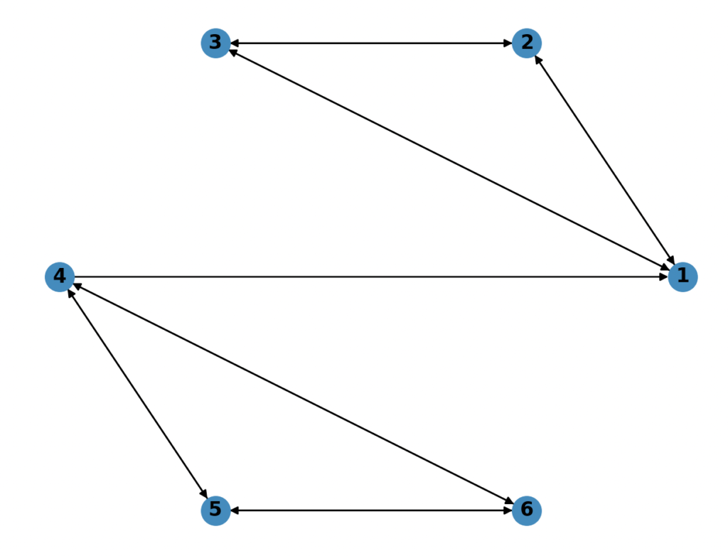
The arrows each represent a win. We have two clusters of teams: 1-3 and 4-6. Now, let’s say teams 1-3 are Duke, Kansas, and Kentucky, and teams 4-6 are Stephen F Austin, Rutgers, and Drexel. Within the clusters, teams are all evenly matched; they are each 1-1 against each other. But if we want to compare the clusters to each other, we are left to rely upon the connection between 1 and 4: SFA and Duke. Intuitively, we all know the the first cluster is much better than the second. But in this totally hypothetical example, SFA pulled off a dramatic upset against the Blue Devils. The computer knows the rating of SFA = Rutgers = Drexel and that the rating of Duke = Kansas = Kentucky and also that the rating of SFA > Duke, ergo every team in cluster 2 must be higher ranked than the teams in cluster 1. Early in the season, we see a lot of these examples, and if you analyze the rankings closely, you can see that certain clusters of teams that have played each other (often in close matches) will be high in the rankings. I call this the cluster problem. As more games are played, however, the graph becomes more connected, and the rankings make more sense. If you have any doubt, check out my 2019 final rankings.
II. Why do other ranking systems do so much better than you early in the year?
Because they cheat!
Not actually. But many of them rely on data beyond the season to fine-tune their rankings early in the year. For example, kenpom and barttorvik have player data at their disposal, and perhaps information on the strength of recruiting classes, historical success of teams, etc. This is why they can issue preseason rankings. My rankings, similar to the NCAA NET rankings, go into this stuff completely blind, using only the data from the season to make judgment. In other ranking systems, it may take a lot to bump Duke or Michigan State out of the top 25, no matter how badly they begin the season, but to me, Duke is just any old team (Kentucky is a very good example of this phenomenon this year). Though this makes my system a little confusing at the beginning of the season, I hope that it has the advantage of surprising me with strong teams that my personal bias would otherwise overlook.
If you made it this far…
Very occasionally people will reach out to me from this website, and I love to hear from them. Feel free to contact me at kylepc13@gmail.com.